Guest-Contributed by Phill Cresswell, UP Hotel Agency
Originally published on the UP Blog.
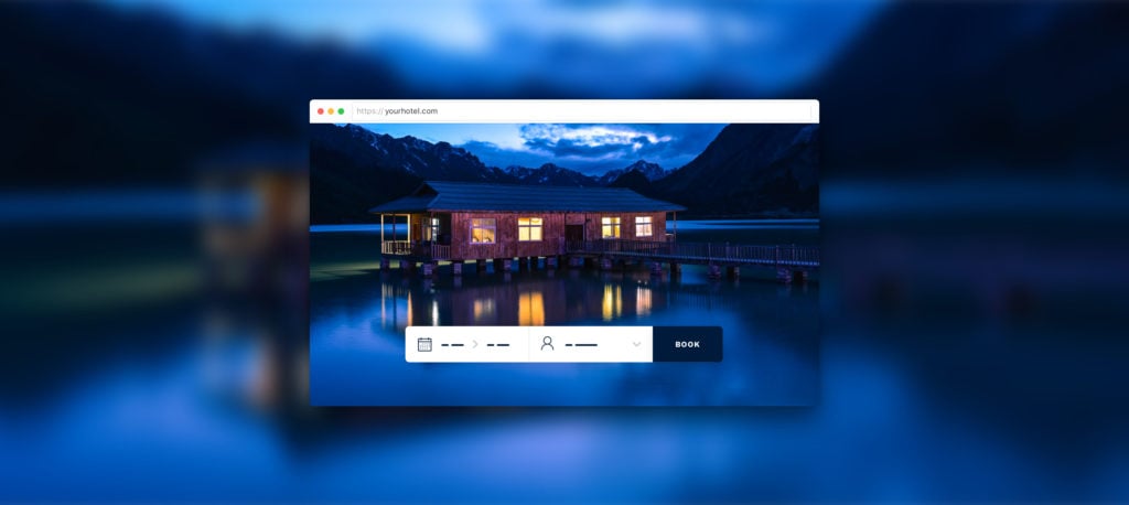
A well-designed booking mask is a great way to accelerate a user’s progress through your hotel’s booking process with a minimum of effort, especially for returning visitors and those comparing rates with 3rd party online travel agents. The further through the booking flow your user is, the more likely they are to commit to a booking. Below are 5 tips and considerations to enhance your booking mask’s user experience.
1. Keep the Number of Fields Low
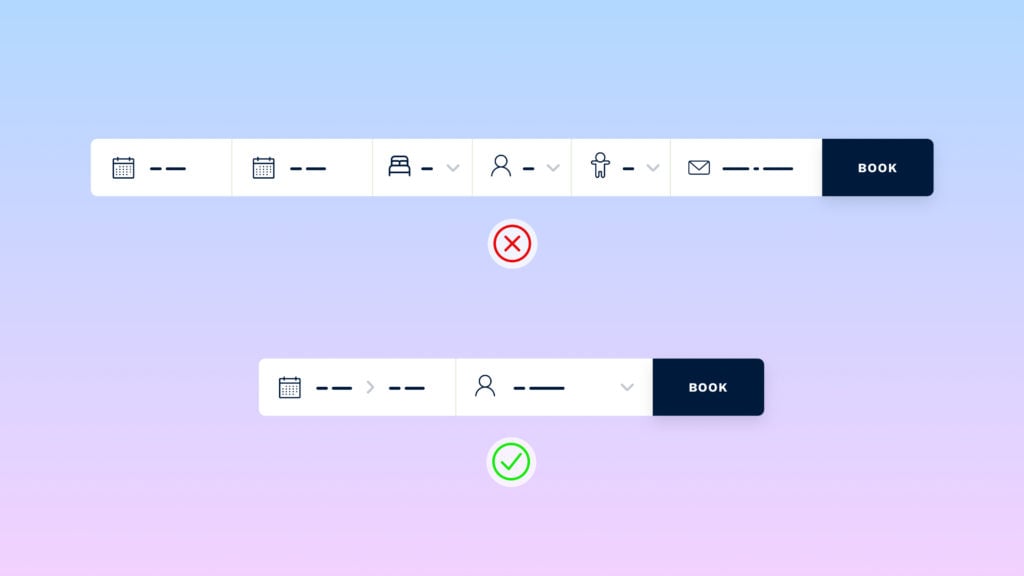
Your booking mask will be much more inviting to use if it has a low barrier to entry. For most property management systems, merely their arrival and departure dates and number of rooms required is enough as a minimum to be able to show tangible results to a user. From here, the user should be able to easily amend their search criteria if need be.
It’s also advisable not to include any fields that require the user to give out any personal information, such as email address or telephone number. This gives the impression of a high level of commitment in order to carry out a search, which will ultimately result in fewer searches.
If a field is mandatory in order to reveal search results, there should be default values set in place so a user can even submit with just a single click. Typically, a default arrival date would be set to the day after they visit the site, and for a single room. However, it would be wiser to examine your property’s past bookings in order to determine the most common default values your users are searching for.
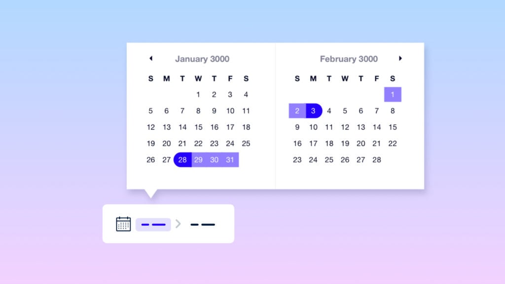
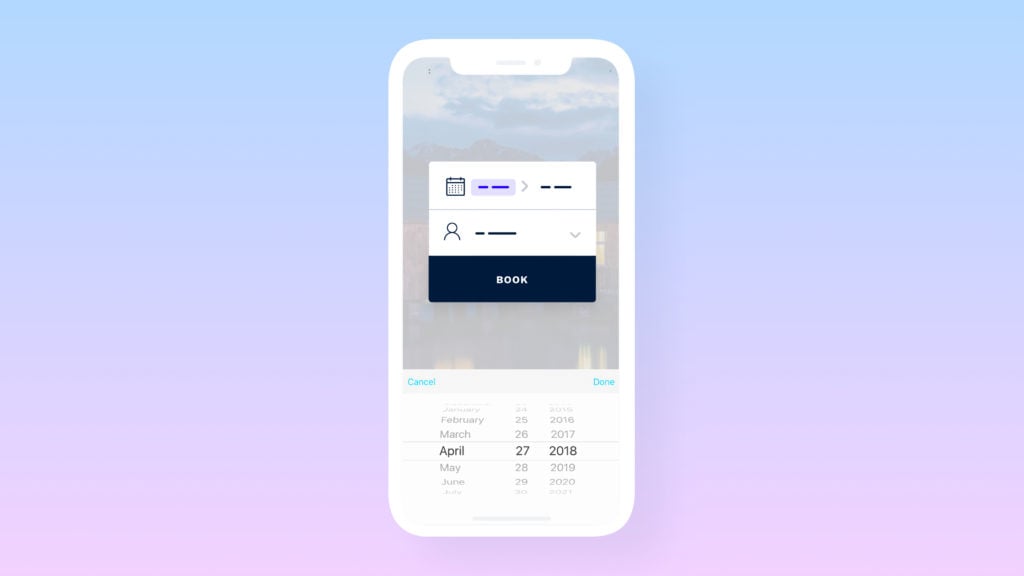
2. Merge Your Arrival and Departure Dates into a Date Range Picker
A booking always requires an arrival and departure date, so merging these fields helps to enhance the relationship between them and can make the experience more convenient than if they were separate. A date range picker helps a user to visualise their selection, particularly intermediate dates.
Although not required, it can be wise to show two months adjacent to each other. This makes it convenient for guests whose stays lie between months. If possible, it is also highly recommended to show room availability for particular dates so users don’t become disappointed if a search reveals no available rooms.
Hinting the total number of nights based on the dates the user has selected can also help to reassure their selection. This is particularly handy when longer stay durations are common for a property.
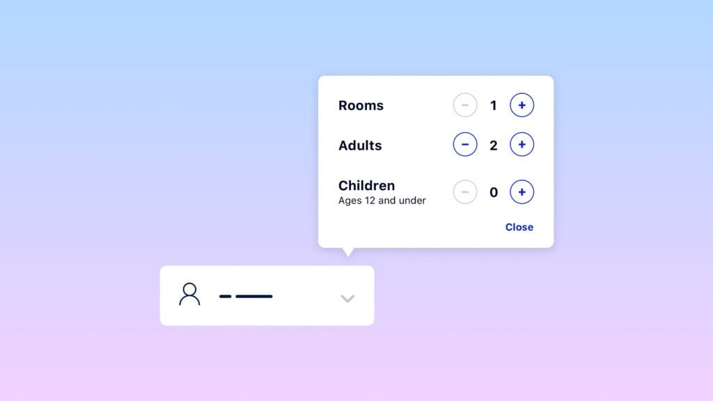
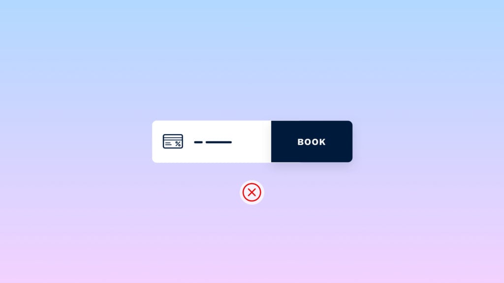
3. Merge Your Rooms and Guest Fields
Much like the date range picker, it can be much less intimidating for a user if number of rooms and guests are merged into one initial field, which then allows for finer detail when interacted with. This gives the initial impression of a single field, rather than several individual ones. Plus and minus buttons rather than select drop-downs are more intuitive controls for these values in most cases, and can be disabled as appropriate when a minimum or maximum value is reached.
This also gives the opportunity to add relational logic to these fields. For example, the number of rooms would never exceed the number of adults, so you could have the value of the rooms field change automatically when the number of adults goes beyond these reasonable limits.
4. Leave Promotional Codes Until Later Stages If Possible
Common sense might dictate that a good deal will help to drive bookings, so a promo code field should be a great idea. However, goodui.org has found with a 13.3% median effect that omitting a coupon field entirely actually has a positive effect on conversion. This might be because it encourages users to leave the site in search of a compatible code – and if a user doesn’t find one, they may not return.
If you must have a promotional code system, it is often better kept further along the booking flow, for example after a user has entered their personal details. At this stage, they are less likely to abandon a booking than if they were at the very first step.
However, adding promotional messaging in proximity to the booking mask is a good way to encourage user interaction. For example, stating rate parity (‘best rates when you book direct’) would help to reassure users you can match online travel agents.
5. Use Native Input Functions for Mobile Devices
What might work on a desktop doesn’t necessarily work on a mobile device, with a smaller viewport and a reliance on touch controls instead of a finer cursor. Thankfully, mobile operating systems offer touch-friendly defaults for inputs such as datepickers and dropdowns.
If your booking mask contains more than two fields, you may wish to consider keeping your booking mask behind an expandable button on mobile devices. Stacking the fields vertically can also help to create a larger area for the user to touch, cutting down on accidental inputs.
In Summary…
The best booking mask for your property will depend entirely on your specific users’ behaviour, but these steps provide a great foundation for common patterns in the hospitality industry.